Guides
Retool Tab Order for Input Fields: What Works and What Doesn't
If you're building a data entry form in Retool and want to control the tab order of input fields, you've probably already discovered the bad news: Retool does not expose a native tabIndex property on its components. There's no field in the component inspector to set tab order, and there's no JavaScript API to change it at runtime. But before you give up, there are practical workarounds worth knowing — and one specific bug to watch out for that will waste your afternoon if you don't.
Why Retool Doesn't Support Custom Tab Order
This has come up repeatedly in the Retool community. The official stance from the Retool team is that tab order should always match visual (DOM) order to comply with web accessibility best practices. Allowing developers to set arbitrary tabIndex values can break the experience for users relying on assistive technologies like screen readers. As a result, Retool has explicitly stated it does not plan to add custom tab order support.
That reasoning makes sense for public-facing web apps. It's more debatable for internal tools — most Retool apps are used by power users doing high-volume data entry who benefit more from an optimised keyboard workflow than from screen reader compatibility. But for now, the constraint is real, so let's work within it.
The Best Workaround: Conditionally Disable Fields to Remove Them from Tab Order
When a Retool component is disabled, it is automatically removed from the tab order. This is the key insight. You can use this behaviour strategically to skip fields you don't want users to tab through, without hiding them from view entirely.
Here's how to set it up step by step:
- Step 1: Identify which fields should be skippable in your tab flow — for example, a read-only reference field or a conditional input that only applies in certain situations.
- Step 2: Add a control component — a
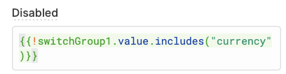
Switch,Checkbox, or aswitchGroup— that determines which fields are active. This can be user-facing or hidden depending on your use case. - Step 3: In each input component's
Disabledproperty, add a conditional expression using{{ }}syntax. For example:{{ !switchGroup1.value.includes('fieldName') }}. When the switch is off, the field is disabled and skipped during tabbing. - Step 4: Set the default values of your control component dynamically if needed. You can drive them from a table's selected row — for instance, using
{{ _.keys(_.pickBy(table1.selectedRow.data, _.identity)) }}to return an array of column names marked astruein your data.
This approach works well for data entry workflows where certain fields are only relevant for specific record types, and you want the keyboard flow to adapt accordingly.
The Tooltip Bug: A Tab Order Trap You Need to Know About
Here's a subtle bug that caught at least one developer in the community thread: if you disable a component to remove it from the tab order but that component has a Tooltip configured, the tooltip element itself may still be focusable. This means pressing Tab will land the cursor on the tooltip — not the input — even though the input itself is correctly skipped. It's confusing and breaks the clean keyboard flow you were trying to build.
The fix is straightforward: conditionally clear the tooltip text when the component is disabled. In the component's Tooltip field, enter a ternary expression like:
{{ self.disabled ? "" : "Your tooltip text here" }}
As long as the tooltip evaluates to an empty string "", Retool will not render a focusable tooltip element, and it will be skipped in the tab order along with the disabled component.
What This Workaround Doesn't Solve
To be honest about the limitations: conditional disabling works well for skipping fields, but it doesn't help if you need to reorder tab focus across non-adjacent fields. For example, if your form layout places components in a grid and you need the tab key to jump column-first instead of row-first, there's currently no clean way to do that in Retool. The tab order will always follow the visual DOM order of components on the canvas.
If your layout allows it, the most reliable approach is to arrange components on the canvas in the exact tab order you want. Retool renders components in the order they appear visually top-to-bottom, left-to-right, so thoughtful layout design is your most powerful tab-order tool.
Should Retool Add a TabIndex Property?
Many developers — particularly those building high-throughput internal tools — would argue yes. A simple tabIndex integer field on each component, defaulting to auto (visual order), would give developers the control they need without breaking anything for users who don't use it. The accessibility concern is valid as a default, but the developer should own that responsibility for their specific context. This remains an open feature request in the Retool community.
Quick Reference: Retool Tab Order Options
- Custom TabIndex property: Not supported. No plans to add it.
- Skip a field in tab order: Set its
Disabledproperty totrueconditionally using{{ }}. - Fix tooltip still being focusable: Set
Tooltipto{{ self.disabled ? "" : "Your text" }}. - Control tab order layout: Arrange components on the Retool canvas in the desired visual order.
- Drive which fields are active: Use a
switchGrouporcheckboxlinked to row data to toggle theDisabledstate dynamically.
Until Retool adds native tab order control, the conditional-disable pattern is the most reliable tool you have. It's not perfect, but combined with careful canvas layout and the tooltip fix above, you can get a keyboard navigation experience that works well for most data entry workflows.
Ready to build?
We scope, design, and ship your Retool app — fast.