Guides
Retool Component Font Size Control: The Complete Guide
Retool component font size control is finally here — and if you've been squinting at 12px labels across your internal tools, this update is a game changer. You can now set font sizes per component via the Styles panel, apply app-wide defaults through App Theme Typography, or pass dynamic values using the FX editor. This guide covers how each approach works, when to use which, and how to troubleshoot the frustrating case where your font size changes simply don't seem to take effect.
How to Change Font Size on Individual Retool Components
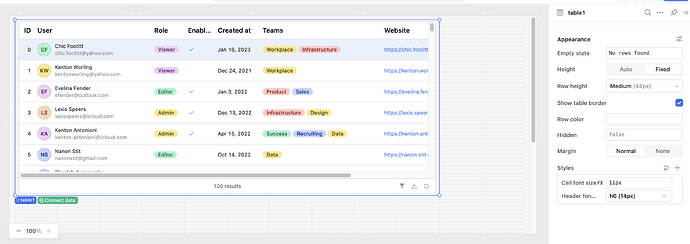
For most components — text inputs, buttons, select boxes, and more — you'll find font size controls directly in the Styles settings panel on the right-hand side of the Retool editor. The available options map to your app's current theme Typography settings (e.g., h6Font, bodyFont), giving you a consistent scale to work from.
- Open your Retool app in the editor.
- Click the component you want to restyle.
- Navigate to the Styles tab in the right panel.
- Find the Font Size dropdown and select a Typography token, or click
FXto enter a custom value like14px. - Save and preview your changes.
The FX button is especially useful when you need a specific pixel value that doesn't exist in your theme scale, or when you want to drive font size dynamically — for example, pulling a value from a query result or a global app state variable.
Note: Some components with their own legacy text size controls — like Divider — haven't been migrated to the Styles panel yet. According to the Retool team, these will move to Styles in a future update.
How to Set a Global Default Font Size for Your Entire App
If you want to increase the base font size across all components at once — say, bumping from 12px to 14px — you don't need to touch every component individually. Use the App Theme instead:
- In the Retool editor, click the App Theme icon (palette icon, top toolbar).
- Go to the Typography tab.
- Adjust the base font size or individual type scale values (e.g.,
bodyFont,h6Font). - Save the theme — changes propagate to all components that inherit from the theme.
This is the fastest way to improve readability across a large app. One Retool user reported going through dozens of screens adjusting components one by one before discovering the App Theme Typography tab — don't make that same mistake.
Why Your Retool Font Size Changes Might Not Be Working
This is the one that trips people up. You change the default font in App Theme from 12px to 20px, and... nothing happens in most components. Some areas update (nav buttons, plain text blocks) but the majority of your components stay at 12px. Here's why:
- Component-level overrides take precedence. If a component was previously given an explicit font size — even the default
12px— that value is stored as an override and will not be replaced by the theme change. You need to clear or reset that override manually. - Check the Styles panel for a hardcoded value. If the font size field in Styles shows a specific pixel value rather than a theme token like
bodyFont, it won't follow the theme. Delete the value or switch it to a theme token. - Legacy components may not fully support the new Styles system. The deprecated Legacy Table Grid, for example, does not receive font size updates via the Styles panel and will not get future feature updates from Retool.
The fix: go through affected components, open the Styles tab, and either clear the font size override or set it explicitly to the value you want. It's tedious for large apps, but once done the theme will govern future changes cleanly.
What About Font Size in the Legacy Table?
If you're on the Legacy Table Grid and hoping for font size controls — it's not coming. The legacy Table is fully deprecated and will not receive new Styles features. The Retool team's official recommendation is to migrate to the new Table component, which offers significantly better performance and an actively developed feature set.
The new Table does have some styling limitations compared to the legacy version — notably less granular control over toolbar background colors and accent row styling — but these are being iterated on. If you need custom row or toolbar styling today, use the FX editor and conditional formatting rules within the new Table component to approximate the look you need.
Bonus: Active Background Color on Buttons
While you're in the Styles panel, check out the Active Background setting for Button components. This lets you set a distinct color that appears when a button is pressed — a subtle but effective way to give users clear visual feedback that their action registered. Set it via the Styles tab on any Button component.
Quick Reference: Retool Font Size Options
Styles panel → Font Size dropdown— per-component control using theme tokensStyles panel → FX button— custom pixel value or dynamic expression (e.g.,11px,h6Font)App Theme → Typography tab— global default for all components that inherit from theme- Legacy Table — no font size control via Styles; migrate to the new Table component
Getting your Retool app's typography dialed in makes a real difference in usability — especially for internal tools that non-technical users interact with daily. Start with the App Theme Typography tab to set a solid baseline, then use per-component Styles overrides for anything that needs special treatment.
Ready to build?
We scope, design, and ship your Retool app — fast.